A New Logo For Algebrakit
When Algebrakit developed its first logo, the company was just starting out with a skeleton staff, a new product, and a small number of clients. According to Algebrakit founder, Martijn Slob, the original logo was meant to suggest the mathematical nature of the product and the fact that it was designed to run as a component inside other websites. Over time, the company began using a gear logo with an “i” in the middle which also incorporated the parentheses.
The former logomark for Algebrakit
Fast forward ten years and Algebrakit is now used by more than a million students, and it is a math technology trusted by some of the leading educational publishers in the world, including Cambridge University Press, Infinitas, and many more. According to Erik de Ruijter, “the original logo looked like it was designed by engineers. Algebrakit is a sophisticated math technology and we wanted our new logo to reflect that.” Algebrakit chose designer Stijn Uijterlinde to lead the brand identity upgrade. According to David Ker, “Stijn was a trusted designer who had been involved in shaping the brand identity of Algebrakit. He really captured our design brief and kept working with us until we were completely satisfied.”
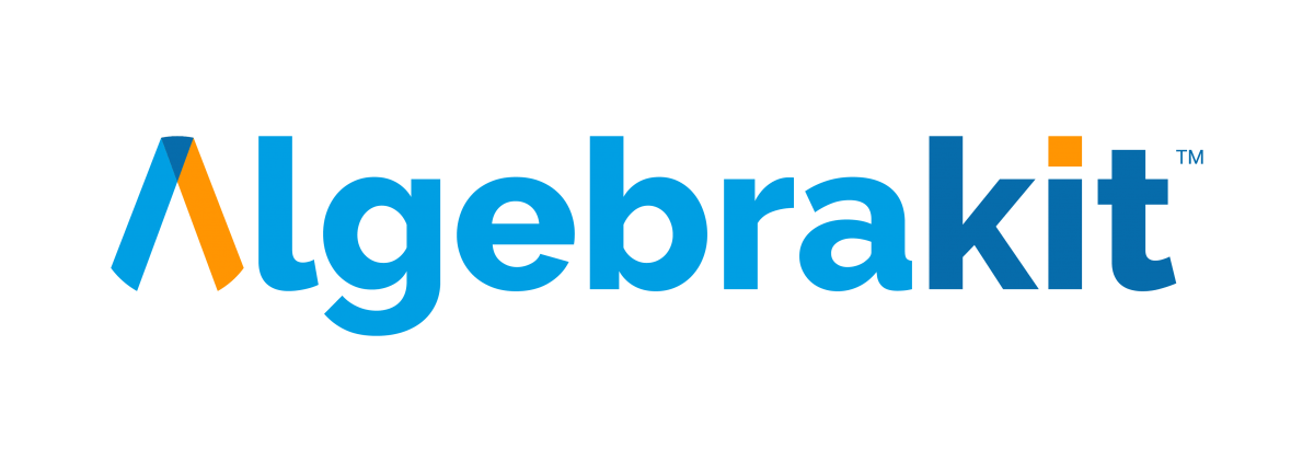
One of the challenges Stijn faced was dealing with the complexity of the original logo. “There is really a lot going on in the logo and I wanted to see how we could simplify the design while still capturing what makes Algebrakit distinctive.” The final logo is an elegant caret symbol suggestive of the letter A. The typeface for the logotype is Raleway which is a Google font that can easily be incorporated in web and print publications. The rounded edges of the logo form a circle and symbolize Algebrakit’s use as a component inside other technologies.
The new logomark for Algebrakit.
The color palette of the Algebrakit logo has expanded. The original light blue has been retained and a dark blue, reflecting the company’s maturity and sophistication, has been added. For energy and excitement, a complementary orange has also been added. The new color combination symbolizes the powerful technology at the heart of Algebrakit’s products while subtly hinting at its roots in the Netherlands.
Algebrakit founder, Martijn Slob, was initially ambivalent about the process. “I’m an engineer not a designer so I didn’t really know what to think about redoing the logo.” But as the process progressed, he discovered that the logo design was helping clarify the vision of who Algebrakit is in the educational market. “The new logo really speaks to the sophistication and distinctiveness of Algebrakit math education technology. Once you see that beautiful logo you will always remember Algebrakit.”
Interested in more?
The best math technology adds value to the existing educational ecosystem while supporting teachers. Are you ready to experience the next-level math capabilities of Algebrakit? Get in contact and we’ll schedule a live demo just for you.


